
Year: 2026
Duration: 2 weeks with iteration
Role: Sole Product Designer
Platform: Web (Desktop)
Skills: Product Design, UX Writing, Behavioural Analysis, Accessibility Collaboration, Design Systems / Component Reuse
Challenges
User challenges
Business challenges
Design challenges
HMW make the required next step after purchase unmissable?
HMW give customers a reason to verify immediately instead of postponing?
HMW increase the self-service ID verification rate to reduce the revenue risk from unprocessed orders?
HMW reduce the manual follow-up load on the customer-care team?
HMW redesign the page working mostly through UX writing and front-end changes, reusing existing components?
HMW balance visual weight between next-step guidance and motivation to act?
HMW support 5 brand identities and 4 use-case scenarios within one layout system?
Status Quo
This was a redesign of an existing, live page — not a 0-to-1 project. Customers were already completing purchases, but too many weren't completing ID verification on their own, and no formal user research (interviews, surveys, usability tests) was run for this project.
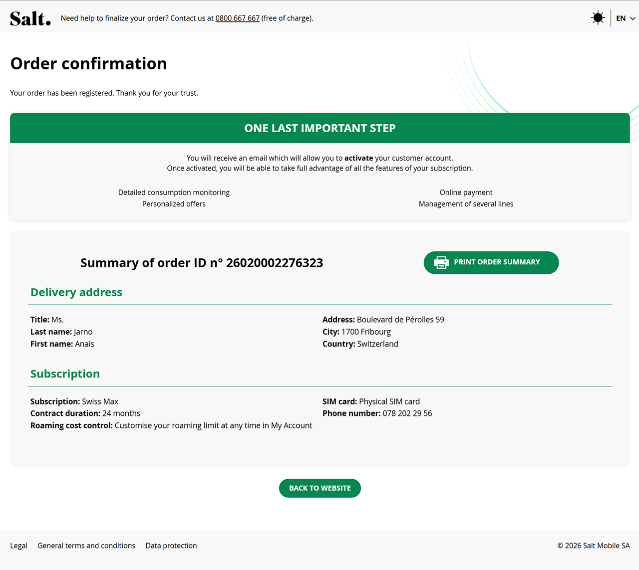
Two issues were identified in the previous design: unclear next steps — copy and hierarchy didn't guide customers on what to do after purchase — and missing motivation — the page gave no reason to verify right away. A behavioural pattern reinforced this: the majority of customers completed account activation but rarely went on to actually use self-care features, the products verification unlocks.
Design Process
Discovery & Research
Analysed existing product knowledge and observed behaviour (no dedicated research phase) to define the two root causes behind low verification rates: unclear next steps and missing motivation.
Ideation & Strategy
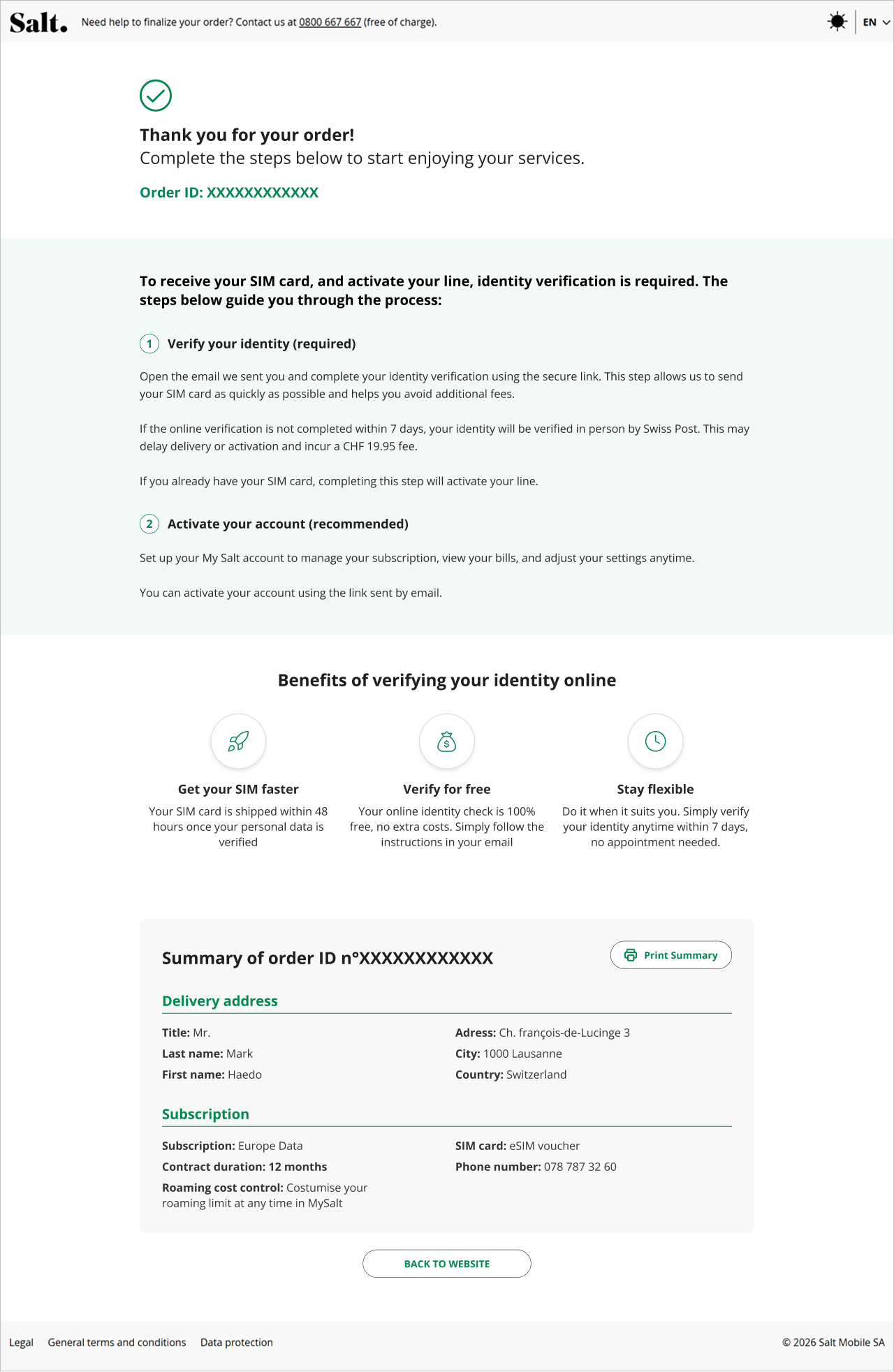
Moved directly to high-fidelity layout exploration — content requirements were already well understood from the live page. Tested a steps pattern (matching the checkout's existing visual language) to reframe activation and verification as one continuous journey, plus a benefits section to motivate immediate action.
Design & Prototyping
Iterated across rounds to balance visual weight between the steps and the benefits — neither could dominate. Designed entirely within front-end-only constraints, reusing existing components rather than building new ones.
Validation & Handoff
Reviewed and validated the final designs with an accessibility expert. Built out across 5 brand identities (Salt, GoMo, Lidl, Post, Sky) and 4 use-case scenarios (new customers, existing unverified customers, existing verified customers, B2B) with IT/engineering.
Final Results
Before
After
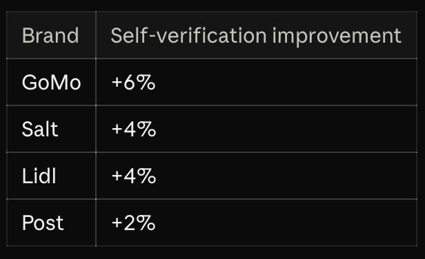
Impact
Learnings
Structure and copy alone shifted behaviour.
No new functionality was needed to move the metric.
Reused components without losing clarity.
Delivered within tight dev capacity by working through UX writing and layout, not new builds.
Skipping formal research was a real constraint, not a choice.
Validating the behavioural pattern with hard data would have sharpened the decisions.
Next time: show the benefit, don't just describe it.
Promote self-care with previews and direct links — the direction of the checkout-flow redesign I'm currently leading.