
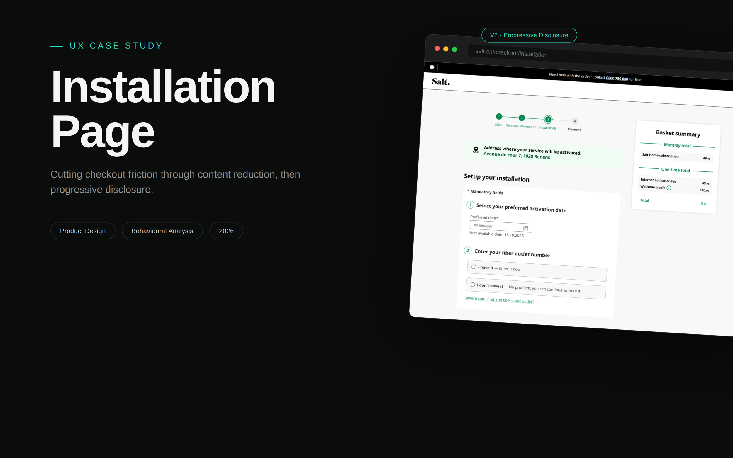
Year: 2026
Duration: V1 shipped April 2026; V2 approved, rolling out October 2026
Role: Sole Product Designer
Platform: Web (Desktop, responsive)
Skills: Product Design, UX Writing, Data Analysis, Competitive Benchmarking, Usability Heuristics (Progressive Disclosure, Hick's Law), Accessibility, Stakeholder Collaboration
Challenges
User challenges
Business challenges
Design challenges
HMW help users complete a step that asks for information most people don't have on hand (OTO number, apartment number)?
HMW communicate unfamiliar technical concepts without burying users in text?
HMW reduce the high bounce rate on this step to improve overall checkout conversion?
HMW deliver this within front-end-only constraints — no backend or data-structure changes allowed?
HMW simplify content without changing the underlying information architecture?
HMW give users control over how much detail they see — letting people who already understand OTO move fast, without leaving those who don't behind?
Status Quo
The installation page sits inside the Salt Home checkout flow, asking for information most users don't already know — an OTO (fiber outlet) number and an apartment number — to proceed with the purchase. Despite explanatory content meant to help, the bounce rate was extremely high, suggesting the volume and presentation of that content was itself part of the problem.
No formal user research was run. Direction came from a best-practices analysis and a benchmark of Sunrise, the closest competitor, which surfaced two differences: Sunrise asks for installation details after purchase (removing it as a conversion blocker entirely — not feasible to replicate here), and keeps its content far lighter within the same stepper structure. Three hypotheses came out of this: content overload, an unfamiliar mandatory field (apartment number), and unclear optionality of the OTO number.
Design Process
Discovery & Benchmarking
Three hypotheses from the drop-off pattern and a Sunrise benchmark: content overload, an unfamiliar mandatory field, unclear OTO optionality. Moved straight to high-fidelity design, reusing design-system components.
V1: Content Reduction
Stripped the page to essentials, linking out for anyone who needs more detail
Reframed the OTO number as optional, not benefit-driven
Removed the apartment-number field entirely — the biggest friction point
Measuring & Re-diagnosing
V1 launched: bounce rate dropped 83.5% → 81.2%, OTO-skip rate jumped 27% → 36%. But bounce crept back to 83.4% within 3 months, while users kept spending 2–3x longer on this page than any other checkout step — a sign of confusion, not disengagement.
V2: Progressive Disclosure
Moved the full educational content into an on-demand modal — lean by default, one click from full detail. Grounded in progressive disclosure, Hick's Law, cognitive load, and the flexibility-of-use heuristic.