
Year: 2025
Duration: 3 weeks of field research + 1 day design
Role: Product Designer — user research, visual design & prototyping
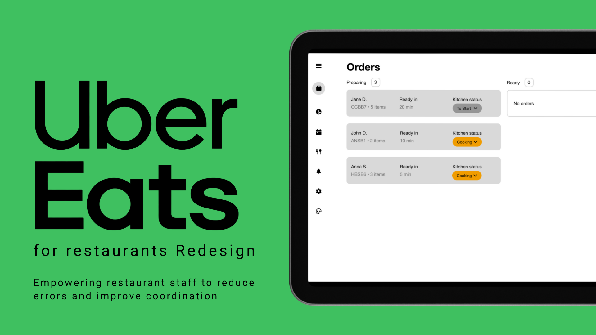
Platform: Uber Eats restaurant tablet (Android)
Skills: Product design, contextual inquiry, interaction design, usability testing, Figma prototyping
Challenges
User challenges
HMW help busy restaurant staff keep track of orders without asking each other constantly?
HMW prevent duplicate orders and accidental mis‑handovers?
HMW reduce the cognitive load of managing multiple orders at once?
Business challenges
HMW improve kitchen efficiency without disrupting existing customer‑facing flows?
HMW reduce the cost of mistakes, which often come out of staff wages?
HMW respect Uber Eats’ language and patterns while adding new functionality?
Design challenges
HMW design an internal status system that works within the constraints of the current Uber Eats app?
HMW deliver a useful solution in a side project with limited time and resources?
HMW ensure high adoption by creating an intuitive, low‑friction interface?
Status Quo
Working part-time in a restaurant gave me a front-row view of how the Uber Eats restaurant app is used:
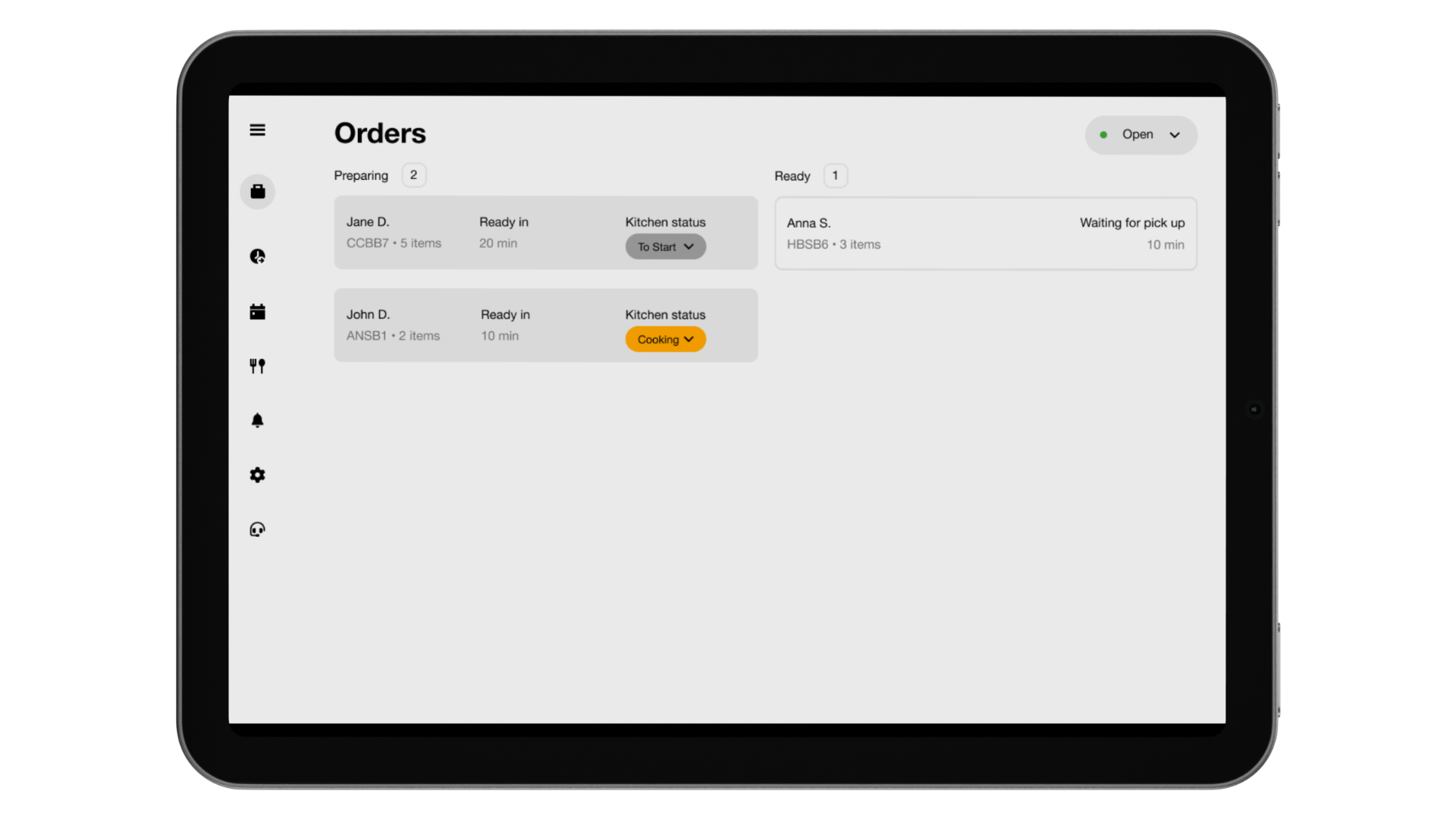
Order sorting: Orders are listed by estimated preparation time, not by when they were placed. If I extend an order’s prep time (e.g., from 15 to 30 minutes), any later order with a shorter ETA jumps above it, making the newer order look more urgent.
No “in progress” status: Staff can’t indicate when an order is already in the kitchen, leading to duplicates.
Accidental “Ready” taps: Notifies the courier and customer instantly, so an early tap can bring couriers before the food is done.
High stakes: Mistakes like duplicates or premature notifications can result in salary deductions. Without in-app coordination tools, we rely on shouting across the kitchen or physically checking with coworkers — inefficient and stressful.
Design Process
-
Discovery & Research
- Spent 3 weeks working at the restaurant while observing team interactions with the Uber Eats tablet.
- Conducted informal interviews and unstructured usability tests with coworkers.
- Identified recurring issues like:
○ Lack of clarity on which orders had been sent to the kitchen.
○ Multiple staff unknowingly handling the same order.
○ Orders appearing out of logical sequence due to ETA-based sorting.
-
Ideation & Strategy
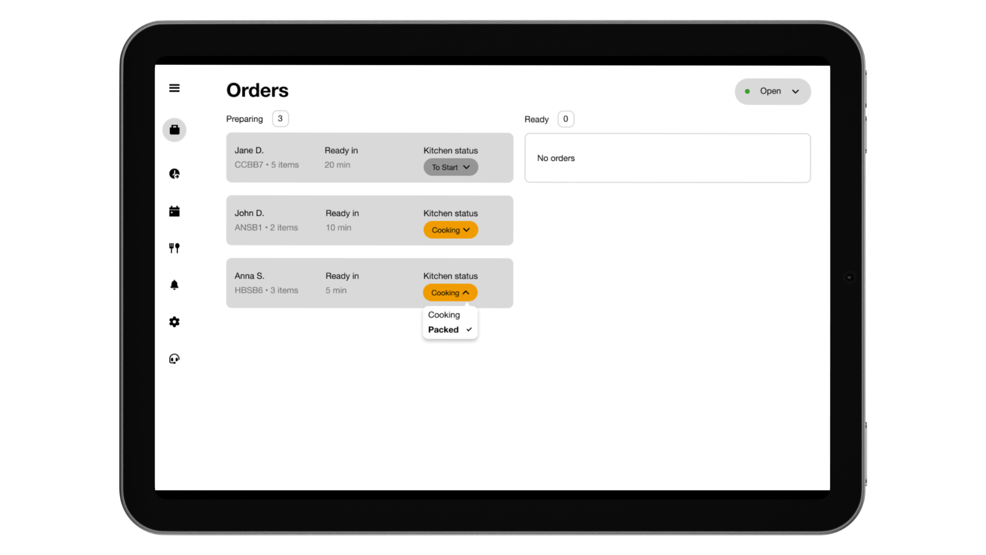
- Added internal status: To Start → Cooking → Packed.
- “Packed” = ready internally, doesn’t notify courier yet.
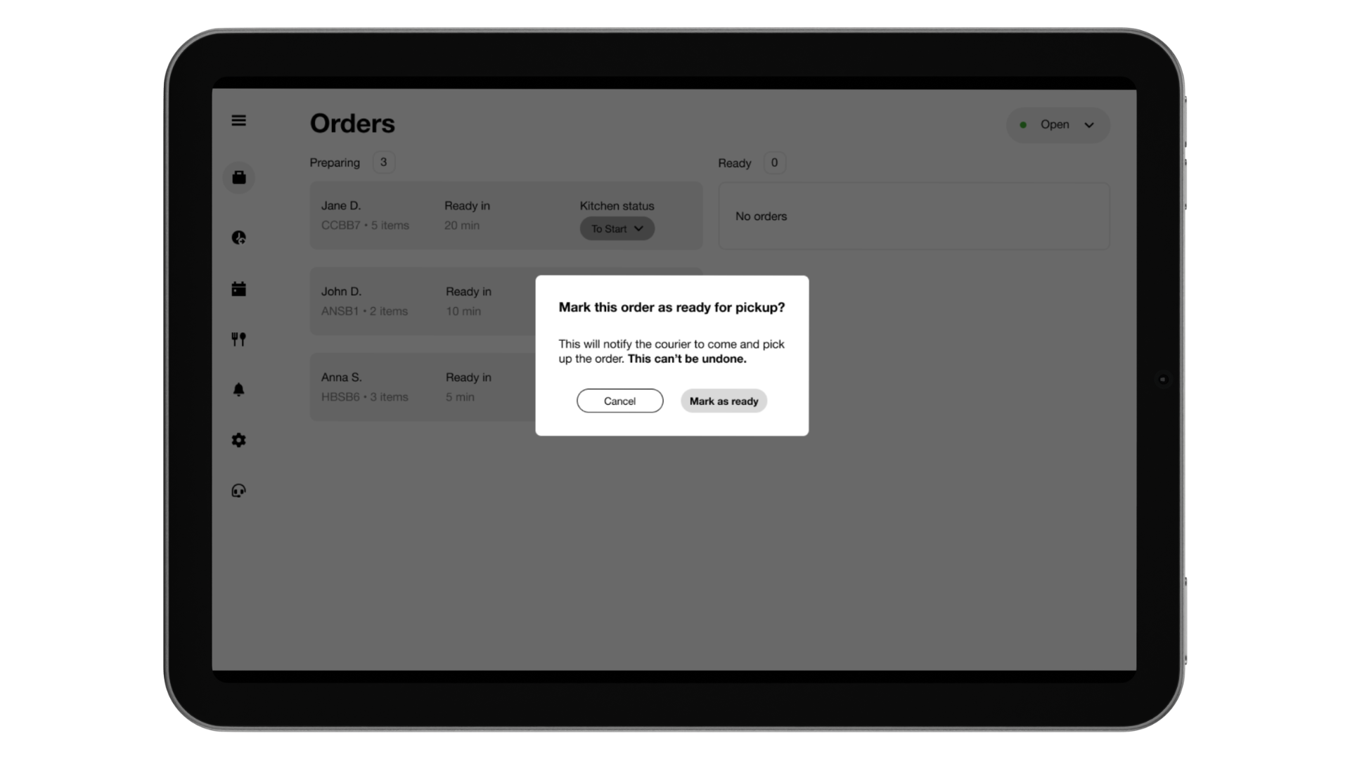
- Added confirmation popup before notifying courier/client:
○ Highlights: “This can’t be undone”.
- Kept Uber Eats patterns like “Ready in X min” and empty states.
- Designed for error prevention without disrupting existing flows.
-
Design & Prototyping
- Designed wireframes and high-fidelity mockups in Figma.
- Key components:
○ Designed 3-state kitchen status: To Start (grey), Cooking (orange), Packed (green).
○ Selecting “Packed” opens a confirmation modal.
- Prevents accidental notifications and adds clarity under pressure.
-
Testing & Iteration
- Renamed internal status from “Ready” to “Packed” after feedback — to avoid confusion with external “Ready” status.
- Added small but impactful copy updates like “This can’t be undone” to reduce user anxiety.
- Shared the prototype with coworkers:
○ All agreed it helped clarify ownership and reduced the chance of errors.
○ Feedback highlighted improved team communication and confidence.
Feedback & Impact
I presented the concept to our team in the restaurant. They could immediately see which orders were To Start, Cooking or Packed. Colleagues said they would no longer need to ask each other if orders had been sent or risk sending the same ticket twice. While this redesign hasn’t been implemented in production, the potential impact is significant:
Reduced errors and cost: Minimises duplicate cooking and premature pickups.
Clear accountability: Each staff member sees the status and can trust the system instead of relying on memory.
Improved morale: Staff are less likely to have wages docked for mistakes beyond their control.
Smooth integration: No changes to the client experience, so Uber Eats’ core flows remain intact.
Learnings
Design from lived experience:
Being both a waiter and a designer gave me unique empathy for the users and allowed me to identify problems that might not appear in remote research.
Balance innovation and constraint:
The most impactful solution respected existing copy, patterns and technical constraints, focusing only on the critical gap.
Error prevention is human‑centred:
A simple confirmation step can protect workers’ pay and sanity, proving that UX can have ethical as well as business value.
Feedback fuels refinement:
Iterative testing with colleagues helped me refine terminology and microcopy (e.g., changing “Ready” to “Packed” and adding “This can’t be undone”).